|
Objectives for Week 8
LInks and media for this week: Self-evaluation of the Alphabet Project answer the following questions as honestly as possible:
0 Comments
Objectives for Week 7
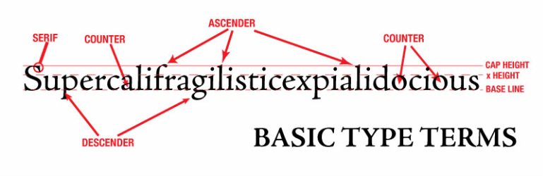
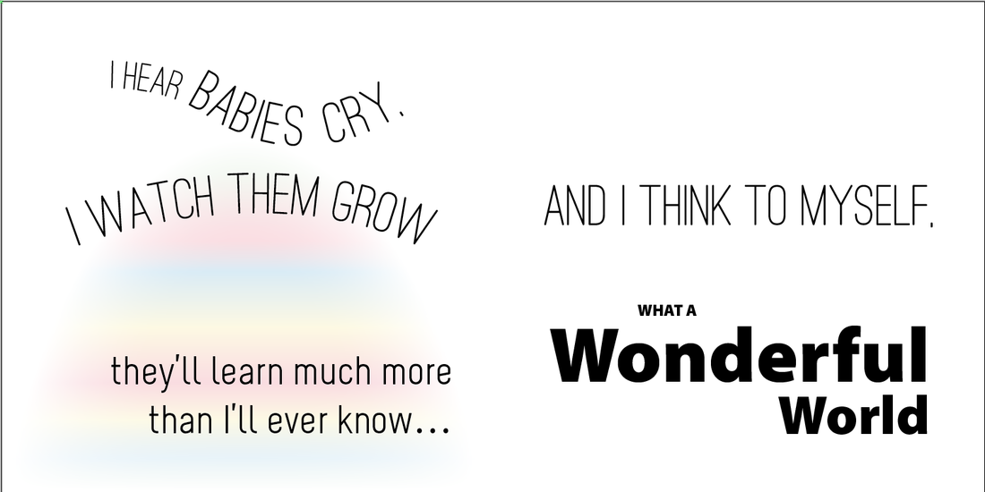
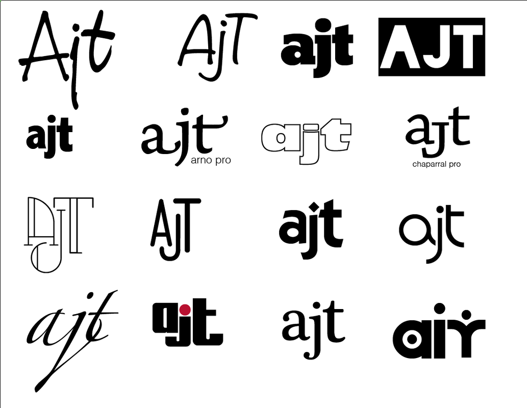
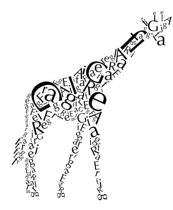
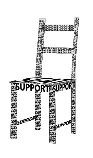
LInks and media for this week: We started working in Adobe Illustrator last week with a few illustration projects (celtic knot, yeti, bears.) Another strong point of Illustrator is its great ability in handling type. For this reason, most logos are created using this program. This week we'll be working on several typographic projects. Type matters as a design element and knowing the language of typography allows us to communicate with other designers. This week's projects:
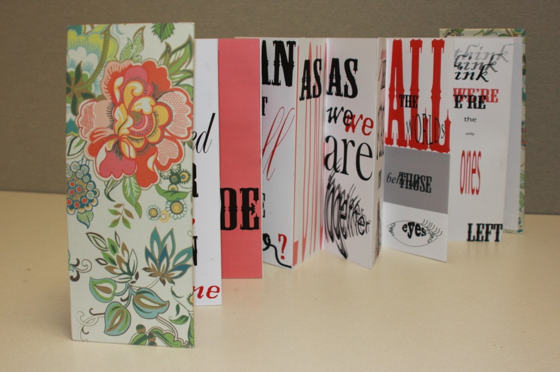
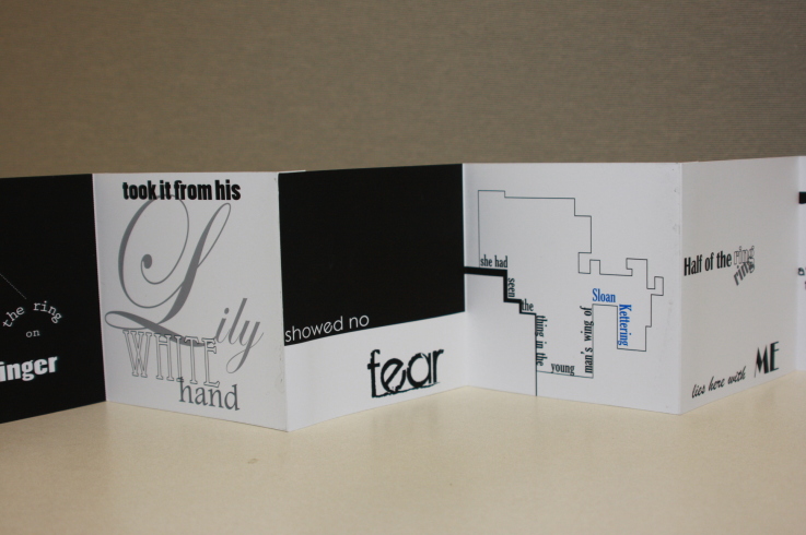
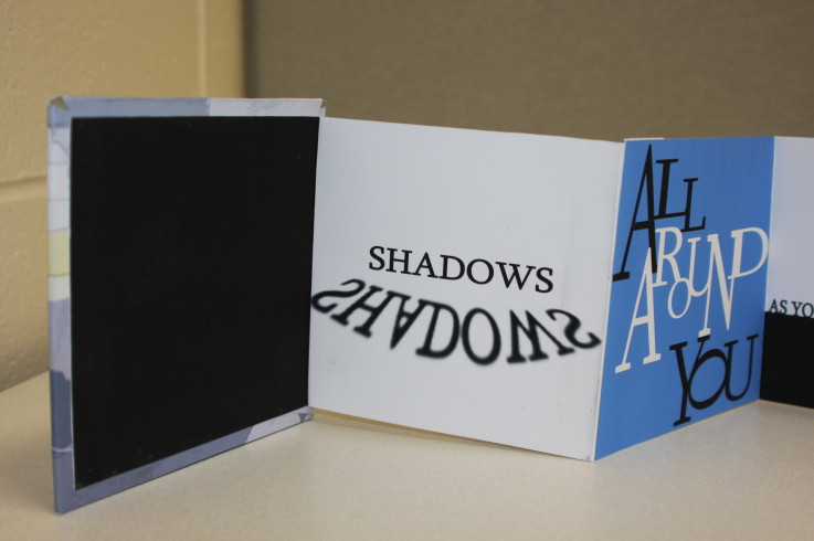
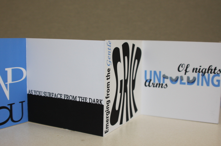
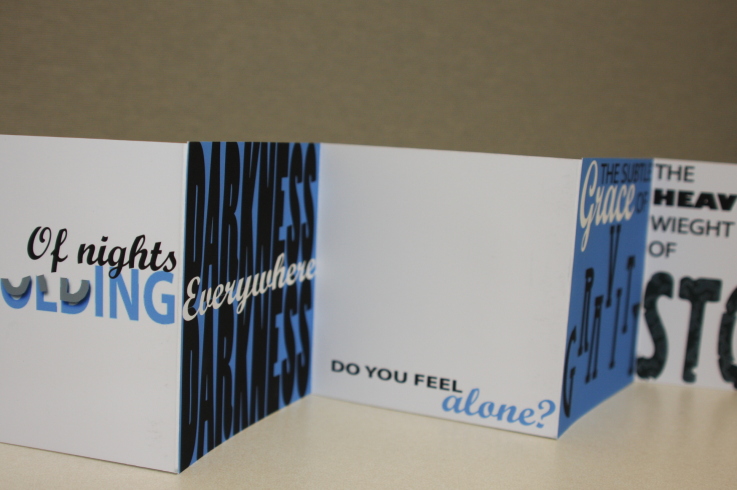
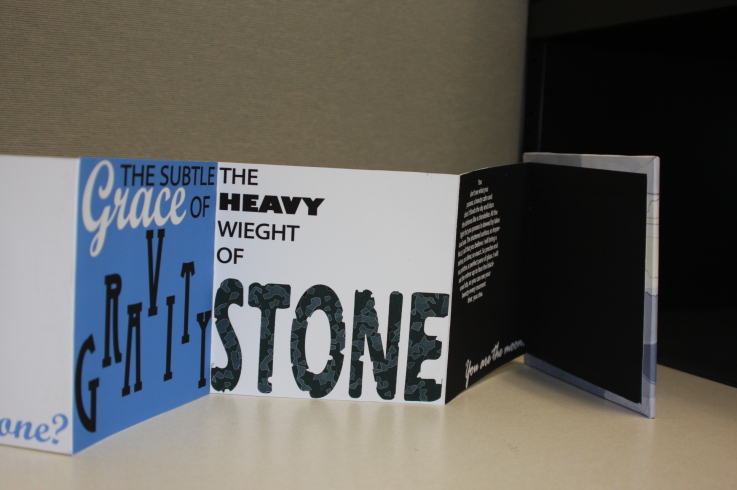
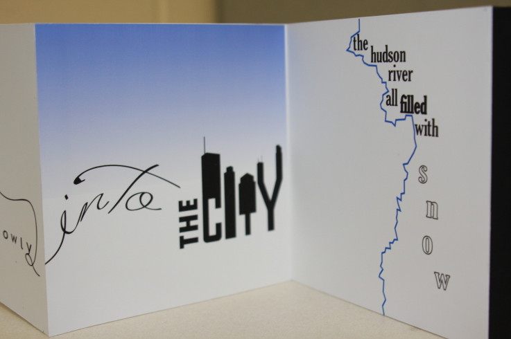
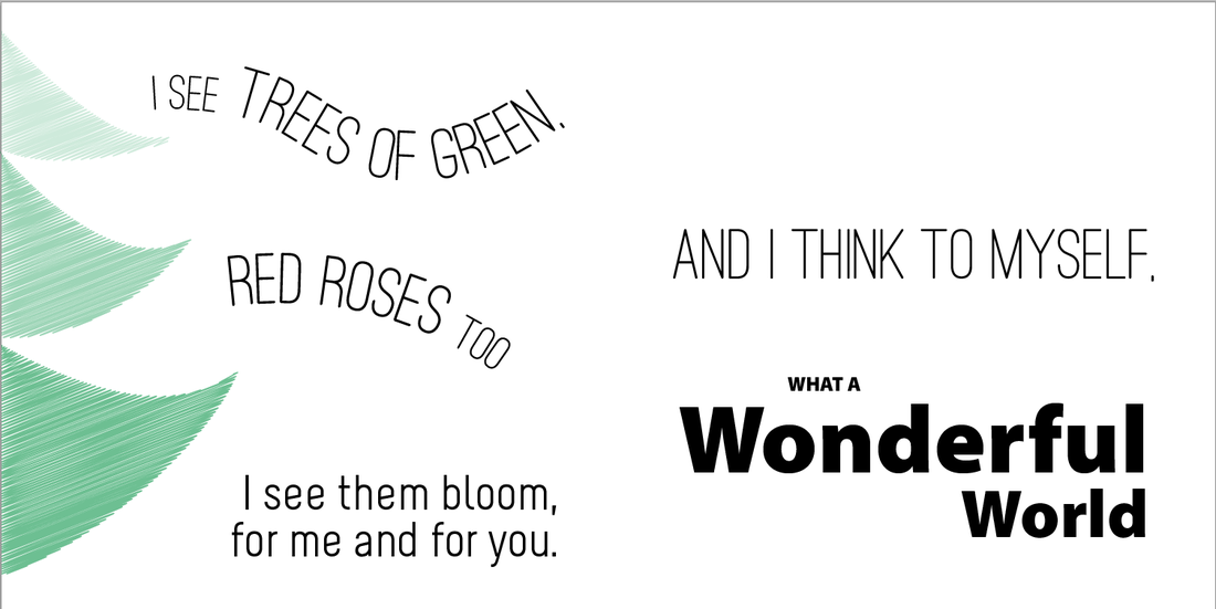
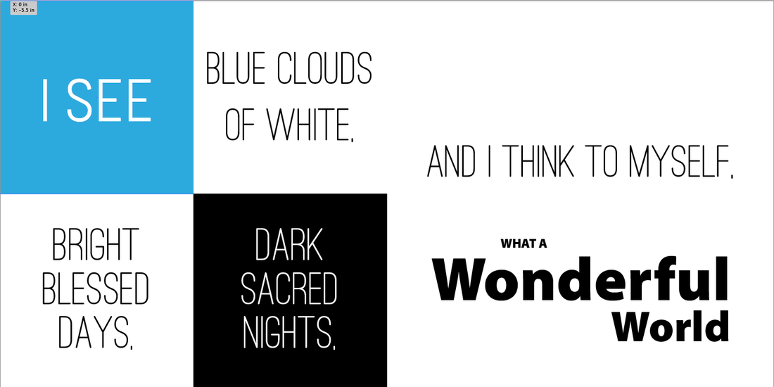
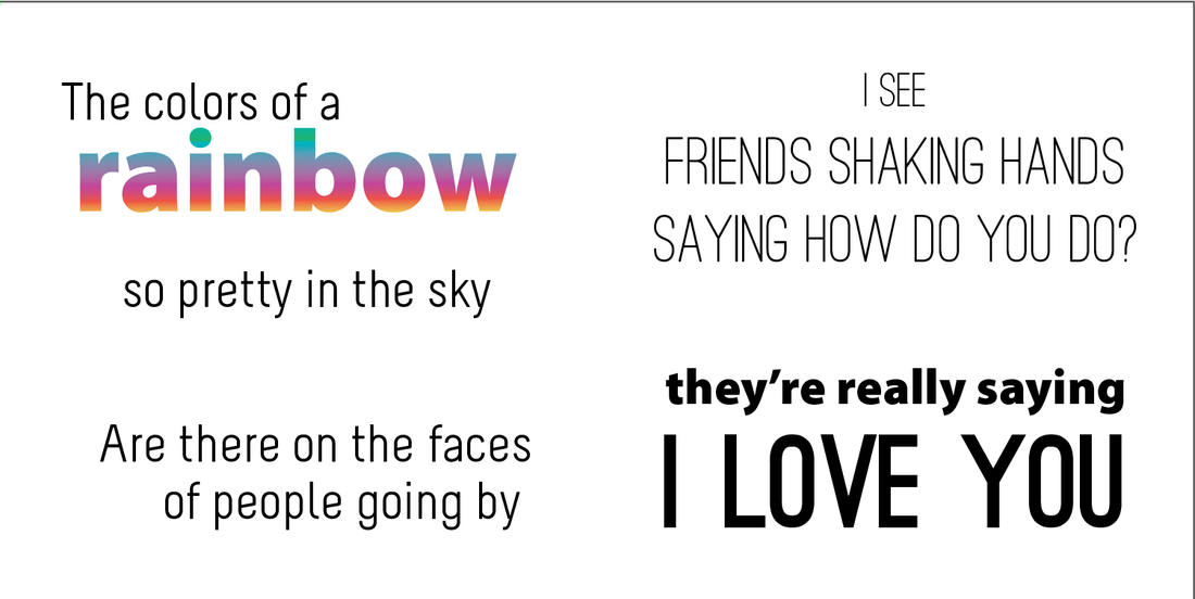
One more week to go before the winter break. The projects that some of you finished last week were some of the best student work I've ever seen in my time in a classroom. The AM students especially seemed to be truly inspired and have fun working on the Typography Accordian books. I hope to have samples of some of the exemplary work so that all of you can see what your fellow-classmates accomplished.
A number of you didn't post to your journals last week. I'd like to see you fix that missing post first thing on Monday. Post the finished Personality of Type and Movie/Book Type Hierarchy exercises that you worked on early last week. The remainder of this week we should be working on finishing the Accordian books. Please remember that it takes both patience and time to complete the bindery of these books so don't wait until Thursday to print out the final book - you won't have enough time to finish the project if you do so. This design and typography work ties directly to the work on this year's yearbook that we'll begin in early 2013. If you need to make up missed work from last week - read last week's Project and Objectives post and follow the directions. I'd like to thank Luna and Dylan for the great work they did early this past week with the TE Middle School tours - you were both great spokespeople for our program and our school. You made me very proud to be your teacher. Thanks! " Faces of type are like men’s faces. As we have worked with the past two projects (logo design & the poster animation), the area where students have struggled the most is with handling type in their designs. This is a common problem. The people that we design for (our audience) often fail to understand the hidden importance of the choices that designers make when designing with type. Designers can't make that same mistake. This week, we'll be working on a number of small projects to help you understand how type also uses contrast (including size, color, shape, and personality) to help form meaning in a design. Here are the steps we'll be following:
The final project we'll be working this calendar year will take about two weeks to create. This project will be due on Thursday, December 20th. You are going to be creating an accordian text book. This will require you to use both Photoshop and Illustrator. Below are the objectives for this project:
           |
 Mr. TuckerMr. Tucker is in his 23rd year as the instructor for the Graphic Arts program. Prior to his teaching career he worked in the flexography industry for ten years and in quick printing for ten years. NEED HELP?Weebly Student Log-in Link
PHYS. ED. DAY
AM - Thursdays - 1 PM - Thursdays - 7 HEALTH DAY PM - Mondays - 7 Lake Photo
|
 RSS Feed